


ADA Wayfinding Signs: Standards, Types, and Installation Guidelines
ADA wayfinding signs combine visual and tactile elements to help everyone navigate buildings and outdoor spaces, including people with vision impairments. These signs feature raised characters, Grade 2 Braille, high-contrast text, and non-glare finishes, all designed to meet Americans with Disabilities Act accessibility standards.
Getting wayfinding signage right involves more than picking signs that look professional. This guide covers the specific compliance requirements, sign types, and installation guidelines that determine whether your facility’s wayfinding signs actually meet ADA standards.
What are ADA wayfinding signs
ADA wayfinding signs are tactile signs that help people with vision impairments navigate public spaces. They feature raised characters, Grade 2 Braille, high contrast between text and background, sans-serif fonts, and non-glare finishes. Most tactile wayfinding signs mount between 48 and 60 inches from the floor, typically near accessible rooms, exits, and key facility features.
The term “wayfinding” covers several sign types that work together to guide people through buildings and outdoor spaces. Directional signs point toward destinations like restrooms or elevators. Informational signs describe facility features or provide general orientation. Room identification signs label specific permanent spaces.
What makes ADA wayfinding signs different from standard signage is their dual purpose. They communicate visually through high-contrast text and symbols, while also providing tactile information through raised letters and Braille that people can read by touch.
ADA wayfinding sign compliance requirements
The ADA Accessibility Guidelines divide wayfinding signs into two categories based on what they identify. This distinction determines whether a sign requires tactile elements or only visual compliance features.
– Tactile sign standards
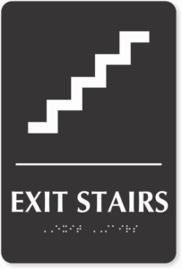
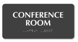
Signs identifying permanent rooms and spaces require both raised characters and Braille. A “permanent” space is any room or area that will consistently serve the same function, like conference rooms, restrooms, offices, stairwells, and exits.
Raised characters allow people with vision impairments to read sign text by touch. The characters rise between 1/32 inch and 1/16 inch from the sign surface, use uppercase letters in sans-serif fonts, and follow specific spacing requirements.
– Visual-only sign standards
Directional and informational signs that don’t identify permanent spaces follow a simpler set of requirements. A sign reading “Restrooms →” points toward a destination without identifying a specific room, so it only requires visual compliance: proper character proportion, adequate contrast, and a non-glare finish.
This distinction often catches facility managers off guard. The arrow sign directing visitors toward the restrooms doesn’t require Braille, but the sign mounted on the restroom door itself does.
– Braille requirements for wayfinding signs
When Braille is required, it follows the Grade 2 contracted format. Grade 2 Braille uses contractions and shorthand to represent common letter combinations and whole words, making it more compact than spelling out every letter individually.
The Braille appears directly below the corresponding raised text, positioned consistently so readers know exactly where to find it.
Types of ADA wayfinding signs
Different sign types serve different navigation purposes, and the ADA applies different requirements to each category.
| Sign Type | Primary Purpose | Tactile Required? |
| Directional | Points toward destinations | No |
| Informational | Describes facility features | No |
| Room identification | Labels permanent spaces | Yes |
| Exit and egress | Marks emergency routes | Yes (at doors) |
1. Directional signs
Directional signs guide people toward functional spaces without identifying those spaces directly. Examples include “Elevator →,” “Main Lobby ↓,” or “Parking Garage →.” Because directional signs provide guidance rather than room identification, they follow visual-only requirements.
2. Room identification signs
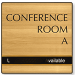
Any sign that designates a permanent room or space by name, number, or function requires full tactile compliance. Office numbers, conference room names, restroom designations, and storage room labels all fall into this category.
 The key word here is “permanent.” A temporary sign for a pop-up event doesn’t require tactile elements, but the sign identifying the room where that event takes place does.
3. Exit and egress signs
Exit signs present a unique situation under ADA guidelines. The tactile sign mounted at the exit door requires raised characters and Braille. However, the illuminated overhead exit sign visible from across a room only follows visual requirements because it’s designed for distance viewing, not touch reading.
ADA wayfinding sign specifications
The technical details of ADA sign specifications ensure that compliant signs actually work for the people who rely on them.
i) Character height and font style
Characters appear in sans-serif fonts, which are typefaces without the small decorative strokes at letter ends. Arial and Helvetica are common examples. The stroke width maintains a ratio between 10% and 30% of character height, creating letters that are neither too thin to feel nor too thick to distinguish.
ii) Contrast and finish requirements
High contrast between characters and background is essential for readability. Dark text on a light background or light text on a dark background both work. The contrast ratio matters more than specific color choices.
The sign surface uses a matte, non-glare finish. Glossy surfaces create reflections under overhead lighting, making text difficult to read for people with low vision or anyone viewing the sign from certain angles.
iii) Raised character standards
Tactile characters use uppercase letters exclusively. The characters rise from the sign surface at a consistent height, with specific spacing between individual characters and between lines of text.
- Character case: Uppercase only for tactile text
- Character height: Raised 1/32 inch to 1/16 inch from surface
- Spacing: Specific requirements between characters and lines
- Font style: Sans-serif with defined stroke width ratios
iv) Pictogram guidelines
When pictograms appear on signs (like the familiar restroom figures or accessibility symbols), they occupy a field at least 6 inches high. A text descriptor appears directly below the pictogram.
If the sign identifies a permanent room, both the pictogram field and the text descriptor follow tactile requirements.
ADA wayfinding sign installation guidelines
Proper installation ensures signs are accessible to wheelchair users, people who are blind, and everyone else who relies on them.
– Mounting height requirements
Tactile signs mount with the baseline of the lowest tactile character between 48 and 60 inches above the floor. This range works for both standing readers and wheelchair users. The sign’s centerline typically falls around 60 inches, which is a comfortable reaching height for most adults.
– Placement at doors and entrances
Tactile room identification signs go on the latch side of the door (the side opposite the hinges). The sign positions so a person can approach within 3 inches without encountering the door swing or any protruding objects.
This clear floor space allows someone to stand close enough to read the sign by touch without obstacles. When a door doesn’t have a latch side, like a sliding door, the sign mounts on the nearest adjacent wall.
– Overhead sign clearance
Projecting signs and overhead signs maintain at least 80 inches of clearance from the floor to their lowest edge. This prevents head injuries for people who cannot see the sign approaching and ensures safe passage underneath.
Accessibility symbols required on wayfinding signs
Standardized symbols communicate accessibility features quickly and universally, working across language barriers.
> International Symbol of Accessibility
The wheelchair symbol (officially called the International Symbol of Accessibility) identifies accessible entrances, parking spaces, routes, and facilities. It appears wherever accessibility features exist, from van-accessible parking spaces to accessible restroom stalls.
> TTY symbol
A telephone handset with radiating lines indicates text telephone (TTY) availability. TTY devices allow people who are deaf or hard of hearing to communicate via typed text over phone lines.
> Hearing loss symbol
An ear symbol with a diagonal line indicates assistive listening systems. Assistive listening technology transmits audio directly to hearing aids, cochlear implants, or dedicated receivers.
Where to use ADA wayfinding signs
Different facility areas have specific signage requirements based on the functions they serve and the navigation challenges they present.
1. Parking lots and accessible routes
Accessible parking spaces display the International Symbol of Accessibility on a sign mounted at each space. Van-accessible spaces receive additional designation indicating the wider access aisle.
2. Building entrances and lobbies
Accessible entrances display the accessibility symbol when not all entrances are accessible. Lobby areas typically include directory signs for orientation, elevator location indicators, and directional guidance to major destinations like restrooms and stairs.
3. Interior corridors and hallways
Directional signs at decision points (intersections, elevator lobbies, stairwell entrances) help visitors navigate efficiently. These signs follow visual-only requirements since they provide direction rather than room identification.
4. Restrooms and common areas
Restroom signs require full tactile compliance since they identify permanent spaces. Accessible restrooms display the accessibility symbol in addition to standard gender identification or all-gender designation.
How to select ADA compliant wayfinding signs for your facility
Choosing the right signs starts with understanding each sign’s purpose. First, determine whether each location identifies a permanent space or provides directional guidance. This determines whether tactile elements are required.
Next, consider the environment. Indoor signs face different durability demands than outdoor signs exposed to weather, temperature changes, and UV light. Materials range from injection-molded plastic for interior applications to solid aluminum or bronze for exterior or high-traffic areas.
When evaluating specific signs, verify compliance features: proper contrast, non-glare finish, correct character specifications, and (where required) Grade 2 Braille positioned below the corresponding text.
FAQs about ADA wayfinding signs
1 What are the penalties for non-compliant ADA wayfinding signs?
A. Facilities with non-compliant signage may face civil rights complaints filed with the Department of Justice, private lawsuits, and required remediation. Penalties can include compensatory damages, attorney fees, and mandatory corrective action.
2 Do ADA wayfinding signs need to be replaced when room names change?
A. Yes. Signs identifying permanent rooms reflect current designations, so a conference room renamed from “Room 101” to “Innovation Lab” requires a new compliant sign. The replacement sign includes updated tactile characters and Braille matching the new room name.
3 Can digital displays meet ADA wayfinding sign requirements?
A. Digital displays supplement but don’t replace required tactile signage. A touchscreen directory in a lobby provides helpful wayfinding information for many visitors. However, permanent room identification signs throughout the building still require raised characters and Braille, which are features that digital screens cannot provide.
4 How often should facilities inspect ADA wayfinding signs for compliance?
A. Regular inspections occur whenever facility layouts change, signs sustain damage, or room designations update. Many facilities include signage review in annual accessibility audits to catch wear, fading, or Braille degradation before complaints arise.
Category: ADA