


Wayfinding: Typestyle do’s and don’ts
With the number of typestyle choices we have at our disposal these days it is very easy to be seduced by something snazzy, but it’s important to ask yourself, “Does this style suit signage?”
There are lots of examples out there of fonts that may be fine for use on a logo or a printed piece but that simply do not translate well for signage and wayfinding applications.
Some typestyles are more obvious than others but there are a couple of basic guidelines that make for better choices for your signage:
Avoid trendy typestyles.
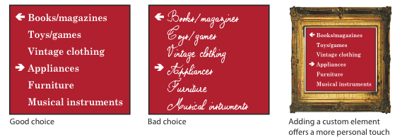
When in doubt it’s probably best to err on the side of caution in this regard and stick with something familiar and readable so that your messages are easily viewed. Retail environments are especially tricky because so many things are vying for the customer’s attention; the wide variety of colorful products, the packaging, point of sales displays, etc. can cause your signage to disappear into the fray. The example below shows three signs with the same content but different typestyles. Rather than relying on a typographic style to give your business a personal touch, keep the sign content traditional and, if desired, get more creative with the sign panel treatment.
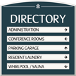
This, of course, does not mean that you should only use Helvetica or Times New Roman — just be sure that your chosen font is readable and works at a distance.
When should you capitalize?
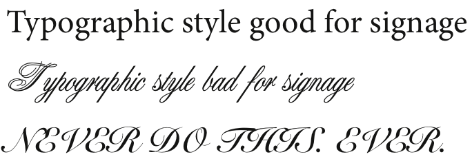
This is one of those arguments in signage that is on-going. Much depends on the number of destinations you have and how quickly you feel they need to be read. But for our purposes here, let’s assume that speed isn’t a factor, but rather the readability, especially within a visually-complex retail environment. There are certain typefaces that have more decorative capital letter forms. Those upper-case characters are meant for use only at the beginning of a word or sentence. We’ve all seen examples of this, and the result is generally the same: What in the world does that say? Eventually you figure it out, but it may take a few tries. One of the most commonly-misused fonts for this example is Old English, but even a script font such as Bickham I’ve seen used with equally unfortunate results:

When in doubt, opt for simplicity and always choose readability over cleverness:
Like this topic? Check out our related products:
-
Custom Directory Signs
-

Entrance Door Signs & Labels
Category: New Products