


The MoMA displays new accessible icon as art
A new, more active accessibility sign for people with disabilities is on display in the Museum of Modern Art (MoMA) in New York City. The updated version of the traditional accessibility icon will be displayed through February 2015 as part of the museum’s “A Collection of Ideas.”
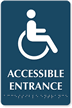
The new design, pushed forward by the Accessible Icon Project, has a point to make. As opposed to the previous one, the new icon depicts the stick figure’s head bent forward to indicate motion, with its hand behind showing active engagement in the movement.
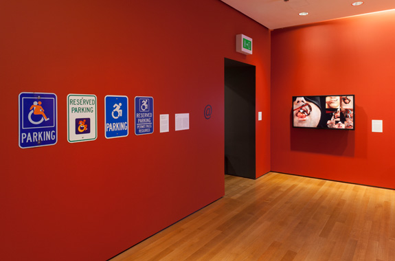
MoMA exhibition of the new accessibility sign shows superimposition of the new symbol over the old one. From Disability Scoop.
MoMA senior curator, Paola Antonelli tells Disability Scoop, “Discussing both the process and the end product of the Accessible Icon Project in the galleries will help demonstrate not only how design works but how it can be applied in the public realm, and by everyday people.”
Sarah Hendron, co-creator of the new design and a lecturer at Rhode Island School of Design started the project as part of “guerilla art” on Boston’s Gordon College campus. BBC’s Ouch reports that the new sign was superimposed on the old sign by sticking a partly transparent sticker on the latter, so both the old icon and the new red figure were visible.
The old sign, known as the International Symbol of Access (ISA), is criticized for showing passivity. “Its arms and legs are drawn like mechanical parts, its posture is unnaturally erect, and its entire look is one that make the chair, not the person, important and visible,”reports the Accessible Icon Project’s site. “Our active accessibility symbol helps re-imagine how society and individuals view people with disabilities,” the site says. Moreover, as the MoMA curator pointed out, the efforts have sparked a discussion.
It sure sounds like an improvement, but the discussion it has elicited also points to the drawbacks of the new sign. The accessibility sign is supposed to show accessibility for people with a span of disabilities, whereas the presence of the wheel chair in the icon subsumes all with disabilities into those needing wheelchairs. So while this may be a step forward, there are more to go.
The museum has been involved in initiatives for people with disabilities and even held a public exhibition of art created in its “Seeing through drawing” classes for those with visual impairment in October of last year.
Like this topic? Check out our related products:
-

Braille Entrance Signs
-
ADA Accessible Braille Signs
-
ADA Bathroom Signs
Category: ADA