


Wayfinding techniques revamp hospital design
Talk about adding insult to injury: to visit a hospital is, in most cases, to get profoundly lost. Signs are few and far between, or scattered about with seemingly little planning. Elevators and hallways never seem to lead where they say they will, and most visitors need a medical textbook to help distinguish what each department’s name really means.

Getting lost in a hospital is an all-too-common problem. From Andri Mall.
Yet a new design trend is changing the insides of America’s hospitals with key planning techniques adopted from malls and airports, the Wall Street Journal. Using a design technique known as wayfinding — a tactic that design firm RSM Design calls a “navigation tool that provides the guest with a sense of confidence and certainty that they will be able to successfully navigate the terrain ahead” — hospitals are making navigation more fluid.
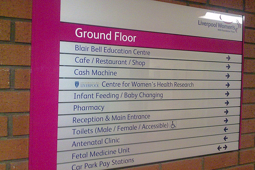
Some of the common problems tackled by wayfinding include multiple entrances and buildings that aren’t marked; nonexistent or difficult-to-find information stations; “visual clutter,” such as signs with too much information; lack of connections between old and new wings; and poorly connected elevators, such as from underground parking lots.
And for some of the more remarkable changes? Interactive kiosks, such as one at the Cleveland Clinic equipped with a talking avatar, which offers customized direction printouts; new, easy-to-understand department titles and signs, such as renaming the Otolaryngology department simply “Ear, Nose and Throat”; and lining routes with notable landmarks, such as the MD Anderson Cancer Center in Houston, which uses a tree sculpture to direct visitors and patients to different areas of the institution.
Hospitals’ general lack of orderly, patient-friendly design often inhibits patient care and approval. One melanoma patient, Marilyn Naiman, told the Post that while she “received excellent care” at the University of Pennsylvania’s Abramson Cancer Center, the hospital and parking garage layout were difficult to navigate, and lacking in signage and information booths. “To be sick and dealing with cancer issues in a building that is not user friendly is your worst nightmare,” she explained.
Size and scope are other factors. Take the Rapid City Regional Hospital in South Dakota, which stretches over 650,000 square feet. Updated signage, including changing medical terms like “Antepartum and Postpartum” to “Labor and Delivery” and updating elevator signs with clear directions to difficult-to-find areas of the hospital, helped.
Changing some of the technical names for departments to words most people know might make this hospital easier to navigate. From Pete.
The new signs used at the hospital are based on a “progressive disclosure” approach often used at airports, which gives visitors just the information needed for the next step in their visit, and nothing more, to minimize confusion. Another wayfinding approach implemented at the Rapid City center is a kiosk system, available at three entrances. Hospital employees have been instructed to look out for patients and visitors who appear lost, and “offer to help, even to escort them.” UCLA Medical Center offers help in the form of college interns serving as hospital guides, too.
Perhaps the most practical issue is, as the Kaiser Permanente medical center of Oakland, California, discovered, how to arrive and leave the hospital. In addition to installing neon bands on its buildings — aimed at increasing visibility from nearby highways — Kaiser also added color-coded banners for different departments… and, let’s not forget, a large welcome sign.
Like this topic? Check out our related products:
-

Medical Office Door Signs
-

Custom Directory Signs
-

Braille Room Signs
Category: New Products


Way-finding signage are necessary thing in hospitals to reach your appropriate destination in right time.