Corporate colors: Do offices decorate for personality or practicality?
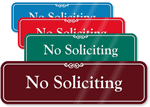
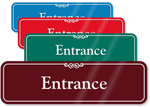
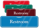
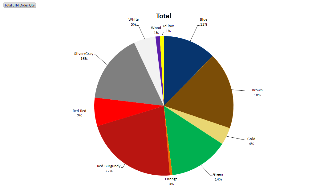
MyDoorSign, a leading supplier of office signs, examined 10,400 orders to better understand the buying patterns of corporate consumers. More specifically, we focused on companies’ color selection beyond the basic black. The colors burgundy, brown, gray, and green were clear leaders in sales, while colors like yellow and orange did not appeal to consumers.
We asked a series of experts about corporate colors and why companies may choose certain color schemes for their office. Is choosing office signs a place for personality or a platform for practicality?
Initial Thoughts
Marlanda Gibson, chair of the Interior Design department at Sullivan College of Technology and Design, examined our chart and shared some of her initial thoughts: “Earth tones are used throughout office spaces and areas that don’t have the opportunity to remodel often. Theorists surmise that this is due to the perception that earth colors are timeless, and appeal to ‘most people.’ Studies show that adults typically respond to primary colors as most appropriate for children, especially when all three are used in conjunction. During the recession there was an increase in neutral colors: blacks, whites, and grays. Consumers felt they needed selections that would go with anything and remain timeless, as the future was uncertain.”
Companies that choose these earth tones do so to appeal to a greater amount of individuals and avoid limiting their identity. They achieve a classic look which suggests longevity and stability. Creating a sleek and well-designed environment with wild or bold color themes can look great, but could imply that the company is a fad, unproven, or even a financial risk.
Burgundy
Burgundy was the best-selling color for office signs, taking in 22 percent of sales. It is more muted than a traditional red and so would not be considered a primary color. Amanda Gates of AB HOME Interiors said, “Burgundy is similar to brown. It’s associated with earth, strength and dignity. It is a refined and old school color that resembles gentility, structure, and heritage. Men love this color, especially accountants, doctors and attorneys.” The fact that both men and the aforementioned positions occupy a place of power in the workplace could contribute to the color’s overall popularity.
Not all agree that burgundy is the best color to work with, though. “Care needs to be taken to really highlight and/or accent this as it is a rather muddy color. This is a safer version of red,” said DeAnna Radaj, author of “Feng Shui for Teens“.
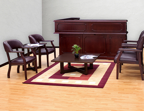
From Regency Office Furniture.
Brown
Brown was the second most popular color with 18 percent of the sales. As noted previously, brown is quite similar to burgundy and shares many of its properties. Both colors are earth tones, muddy, and muted.
Gates said, “Psychologically, brown reminds us of soil, earth and is considered a grounding and organic color. It is rich, easy to work in, and gender neutral.”

From Jeff Kramer.
Gray
Gray, another neutral color, ranked third in our sales. At 16 percent, this hybrid of black and white saw much success in offices around the United States.
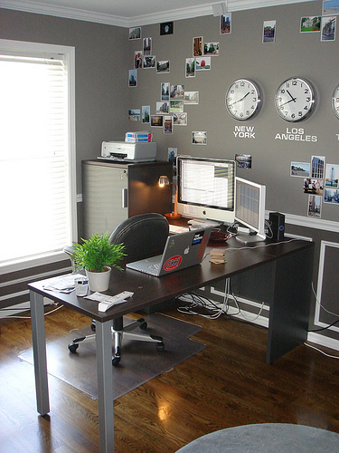
From Blake Cottington.
However, not everyone is as supportive of gray as a top choice. Gates warns, “This one can be tricky! Gray has a lot of different undertones and if chosen incorrectly can go cool or warm quickly. Considerably trendy at the moment are brown/gray palettes. Gray works with pops of color and is considered a hot trend, which would explain the spike in popularity.”
Betsy Karp, The Colour Coach, said, “Gray is a healing, neutral color, that is cool, conservative, non-committal, and contemplative. It is used as a backdrop for reflection. Consider it a neutral palette that has the power to shift the direction or course of your life. Gray helps you collect thoughts and think in a more solid and practical way.”
Green
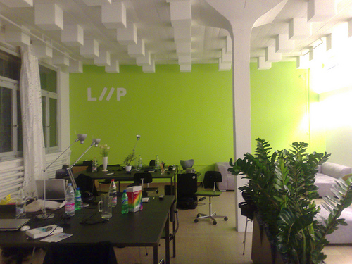
Green came in fourth with 14 percent of sales. Green is a secondary color, as is orange. This is interesting, considering the success of green and failure of orange. Green is also a natural earth color, which may help explain its rank.
Gates said, “Green is often associated with balance and growth, grass roots, and is considered a neutral when it is a warm hue. Most of the population loves a warm sage or earth green.”
Karp said, “Green is a wonderful, positive, and grounding color. Green promotes health, success, and wealth. More offices should go with this color. It is healing, balancing and attracts the energy of money as well.”
From Joel Bez.
Yellow and Orange
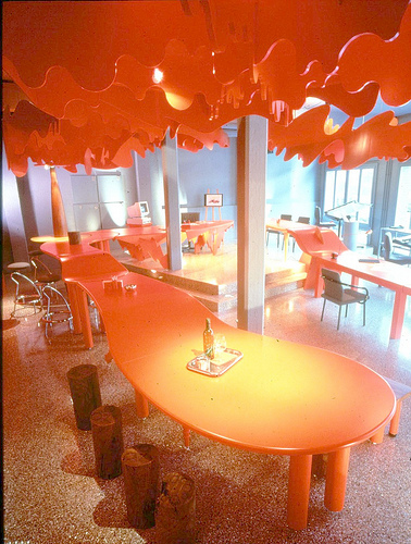
Yellow and orange had shockingly low sales. Both bright, sunny colors barely made the chart. Yellow received only 1 percent of all sales, while orange signs weren’t even purchased once. Why are these colors performing so poorly?
From Peter Klick.
DeAnna Radaj, author of “Designing the Life of Your Dreams from the Outside In,” said, “Yellow is the hardest color for the eye to ‘break down’ and can cause some dissonance for the eye-brain connection. For highly sensitive individuals and those with anxiety disorders, yellow can be very jarring and unsettling. Yellow should only be used as an accent color or highlight color.”
Jennifer Reynolds, ASID, IIDA, principal of Ideation Design Group, said, “Yellow and orange are not favorable for several reasons. In terms of signage, both colors are hard to read. They are highly reflective and unless they’re put on a starkly-contrasting background, they may blend with surrounding colors. In addition, the eye has a hard time differentiating shapes in those colors. As for design, yellows and oranges are used minimally as they are somewhat over stimulating. Many designers subscribe to the fact that yellows and oranges are good for kids’ environments because they are visually stimulating and keep kids interested. In the workplace, that is not how you want your employees or staff to be stimulated. You want them focused on what they are doing.”
Karp said, “It is very sad that more office and industrial spaces don’t use yellow and orange. I think corporations may be afraid employees won’t be serious and get their work done. I believe the opposite to be true. Both of these colors promote enlightenment, positivity, courage, growth, healthy self-esteem, and creativity.”
Pablo Solomon, an artist and designer, said, “Color can be cultural. In Mexico, Latin America, Italy, South of France, the yellows, oranges, and terracottas are extremely popular.” Perhaps we avoid these colors in favor of more traditional, subdued American color schemes.
Conclusion
All of the designers and color experts seemed to agree: neutral tones like navy blue, brown, and burgundy convey longevity and security. Bright tones are more experimental, can be susceptible to trends, and are uncomfortable for some to be surrounded by. Business owners should think about what message they want to convey and who they want to attract. This attraction is not only important when thinking about customers, but when recruiting employees and creating a unified company culture. Is it a fast-paced business that changes course rapidly? Or a stable firm that values security, safety, and comfort?
Mayer Dahan of Dahan Properties concludes, “Earth tones are selected more often than primary colors for conference and office settings, because earth tones are very consistent. Earth tones like burgundy and brown match perfectly with one another without becoming overwhelming. You can’t match a pastel blue with a pastel pink without it overwhelming the eyes. Earth tones are also more calming and evoke feelings of tranquility, a very necessary emotion in a stressful office setting.’’
Reynolds said, “Earth tones coordinate well, there is a large selection of accent colors that works with them and they give the ‘natural’ appearance to a space making it more mentally inviting. The neutral or earth tone palettes are also very flexible. You can easily pair up a brown palette with some natural stones and wood flooring to create a more upscale environment. It is difficult to do that with a yellow or orange and not have it look fake or forced. Most good office designs start out with a neutral palette and then add a pop of color or texture that gives them a wow moment. Most often the wow moment is the signage or imagery or something that identifies the office identity/logo.”
Fortune 500 Implications
A great example of two businesses in the same vertical that use different colors are the banks Ally and Chase. While we won’t dive into their offices to see what color the walls are, we can simply take a look at their logos and websites.
Ally and Chase both pick dark colors, purple and blue respectively, and compliment them with black. Black is typically used by many financial companies to convey trust and safety. However, Blue is a much more natural and timeless color than purple. Ally uses purple to distinguish itself as different, people-centric, and new (they became a bank holding company in Dec. 2008). Chase uses blue to maintain its credibility and trustworthiness along with rival financial institutions like Citi, American Express, MetLife, Bank of America, Barclay’s and more.
How does your business use color? Is personality key to customer appeal or is a practical, timeless approach best? Let us know in the comments below!
Category: New Products, Office courtesy


