Make sure that you follow the guidelines. Click on the headlines below.
1.
Finish
and Contrast
Characters must have an eggshell, matte or non-glare finish. For easier
readability, avoid signs with a shiny or gloss finish including some
metal, glass and stone finishes.
Characters must contrast with the background by 70%.
2.
Use
Grade 2 Braille
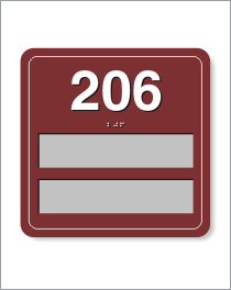
Room signs must have raised characters and use Grade 2 Braille. Tactile
characters and Braille must be raised 1/32". Unlike Grade 1 Braille,
Grade 2 Braille uses a series of contractions which forms a shorthand
version of the text.
3.
Inserts
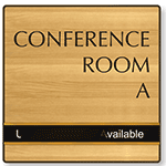
Made in the Field
They do not have to use
raised characters and Braille. Information such as employee names,
dates, policies, directional information and schedules can be hand
written or typed by the user. This part of the sign does not need
to comply with ADA.
4.
Use
Approved Fonts
Characters must be in upper case and use a sans serif or a simple
serif font. For room signs, the font can be no less than 5/8" high
and no more than 2" high. Overhead signs require fonts that are at
least 3" high.
5.
Use
Large Pictograms
A Pictogram is optional -but, if used, the Pictogram must be at least
6" high. The equivalent verbal description must be placed directly
below it, along with the accompanying Grade 2 Braille.
6.
Mount
Signs Correcty
Room signs should be mounted on the wall adjacent to the latch side of the door. When mounted,
the centerline of a room sign should be 60" from the floor.
7.
Consult
the Law
Learn about the law from the U.S. Department of Justice
ADA
home page
.


)
)
)
)
)
)
)